Infographics turn complex data into visuals people actually look at — and remember. Whether you're a student building a class project, a marketer explaining a process, or a researcher presenting findings, understanding what an infographic is, the main types, and how to create one saves hours and makes your content far more effective. This guide covers everything: definition, types, infographic examples, and how to make your own.

- An infographic is a visual representation of data, information, or knowledge — designed to communicate quickly and clearly.
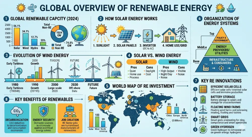
- The main types: statistical, process/timeline, comparison, geographic, hierarchical, and list-based.
- Below: types of infographics with examples, plus how to create your own for free.
What Is an Infographic?
An infographic (short for information graphic) is a visual design that combines data, text, icons, charts, and illustrations to explain a topic clearly and quickly. Unlike a report or article, an infographic is designed to be scanned — the reader grasps the key points in seconds through visual hierarchy, color, and layout.
Infographics are used in education, journalism, marketing, science, and business to make complex information accessible. According to research from the MIT Media Lab (referenced by sources like Venngage and HubSpot), the human brain processes visuals 60,000 times faster than text — which is why data infographics are so effective.
Types of Infographics (with Examples)
| Type | What it shows | Example use case |
|---|---|---|
| Statistical | Data, numbers, percentages — visualized through charts, graphs, and big numbers. | Survey results, annual reports, market research. |
| Process / How-to | Steps in a sequence, workflows, instructions. | Recipe steps, onboarding flow, "how it works" explainers. |
| Timeline | Events in chronological order. | Company history, project milestones, historical events. |
| Comparison | Two or more options side by side. | Product A vs. Product B, pros and cons, before/after. |
| Geographic / Map | Data tied to locations. | Regional sales data, population statistics, travel routes. |
| Hierarchical | Ranked or layered information (pyramid, org chart). | Maslow's hierarchy, organizational structure, food pyramid. |
| List-based | Numbered or categorized items with visual design. | "Top 10 tips," resource lists, checklists. |
| Informational | A topic explained with sections, icons, and short text blocks. | Awareness campaigns, educational summaries, "did you know" formats. |
Infographic Examples for Students
Here are infographic ideas for students by subject, with the best type for each:
| Subject | Infographic idea | Best type |
|---|---|---|
| Science | The water cycle, stages of cell division, the solar system to scale. | Process, hierarchical. |
| History | Timeline of a war, comparison of two civilizations, map of trade routes. | Timeline, comparison, geographic. |
| Math | Statistical survey results from the class, probability visualized. | Statistical. |
| English / Literature | Character comparison, plot timeline, book vs. movie differences. | Comparison, timeline. |
| Health / PE | Nutrition breakdown, exercise routine steps, sleep statistics. | Statistical, process, list. |
| Social studies | Election results by region, population growth timeline, government structure. | Geographic, timeline, hierarchical. |
The best student infographics focus on one clear message and use no more than 3–4 colors. A common mistake is cramming too much information — an infographic isn't a report with pictures. It's a visual that communicates one thing well.
How to Create an Infographic (Free Tools)
| Tool | Free | What it offers |
|---|---|---|
| Canva | ✅ | Hundreds of free infographic templates, drag-and-drop editor, export to PDF/PNG. The most popular choice for students. |
| Piktochart | ✅ (limited) | Infographic-focused tool with data visualization features. Good templates for statistical and process infographics. |
| Venngage | ✅ (limited) | Templates organized by type (statistical, comparison, timeline). Student-friendly. |
| Infogram | ✅ (limited) | Strong for interactive charts and data-driven infographics. Embed online or export. |
| Google Slides / PowerPoint | ✅ | Not purpose-built, but you can create infographics using shapes, icons, and charts. Export as image or PDF. |
5 Design Principles for Effective Infographics
- One message per infographic: decide the single takeaway before you start designing. Everything else supports it.
- Visual hierarchy: the most important information should be the largest, highest, or most colorful element. Guide the eye from top to bottom.
- Limited color palette: use 2–4 colors maximum. Too many colors create visual noise. Pick a palette that matches your topic's mood.
- Icons over text: replace paragraphs with icons, charts, and short labels. If a section has more than two sentences, it's too long.
- White space: don't fill every inch. Space makes the content easier to scan and the design more professional.
💡 Pro tip: If you need to present your infographic's data as a slide deck — for class or a meeting — tools like Gamma.com.ai can turn your content into designed presentation slides automatically, with charts and visual layouts built in.
Conclusion
An infographic is a visual way to communicate data, processes, comparisons, or information — designed to be understood at a glance. The most common types are statistical, process, timeline, comparison, geographic, hierarchical, and list-based. For students, infographics are a powerful way to present research, summarize topics, and make class projects stand out. Use free tools like Canva, Piktochart, or Venngage to create yours, and follow the core principles: one message, limited colors, visual hierarchy, and plenty of white space.
FAQs
What is an infographic?
An infographic (information graphic) is a visual design that combines data, text, icons, and illustrations to explain a topic quickly and clearly. It's designed to be scanned rather than read — the viewer grasps the key message through visuals, not paragraphs.
What are some good infographic examples for students?
Science: the water cycle or cell division process. History: a timeline of key events. English: character comparison chart. Math: class survey results visualized. Health: nutrition breakdown or exercise routine. Choose the infographic type that matches your content — timeline for sequences, comparison for side-by-side, statistical for data.
What is the best free tool to make an infographic?
Canva is the most popular — hundreds of free templates, drag-and-drop editing, export to PDF or PNG. Piktochart and Venngage are also strong options with infographic-specific templates. Google Slides works too if you're comfortable with shapes and charts.
What's the difference between an infographic and a poster?
An infographic focuses on data and information, using visual hierarchy to guide the reader through content. A poster is broader — it can be promotional, decorative, or event-focused. Infographics are always informational; posters can be anything.
How many types of infographics are there?
The main types are: statistical, process/how-to, timeline, comparison, geographic/map, hierarchical, list-based, and informational. Most infographics combine elements of two or more types.