Color is one of the first things your audience notices — before they read a single word. The right color palette for a presentation makes your slides look polished, keeps your content readable, and sets the tone before you even start speaking. The wrong one makes everything look cluttered or hard to read. This guide covers the best colors for presentations, how to choose a palette that works, how to change your color theme in PowerPoint and Google Slides, and ready-to-use palettes you can grab right now.

- A good presentation palette has 3–5 colors: a background, a primary accent, a secondary accent, a text color, and optionally a highlight.
- Blue is the most popular presentation color — it signals trust, calm, and professionalism. Warm blues add energy without losing that credibility.
- Below: the best colors for presentations, ready-to-use palettes, and how to change your color theme in PowerPoint and Google Slides.
Why Color Matters in Presentations
Color isn't decoration — it's communication. Research in color psychology consistently shows that colors influence mood, attention, and perception. In a presentation context, color does three jobs:
- Sets the tone: blue feels professional, red feels urgent, green feels natural.
- Guides the eye: a bright accent draws attention to the one thing you want people to see.
- Creates consistency: a unified palette makes a 30-slide deck feel like one cohesive story, not a patchwork.
The simplest rule: limit your palette to 3–5 colors, use them consistently, and make sure text is always easy to read against the background.

Best Colors for Presentations (by Purpose)
Different colors work for different goals. Here are the best colors for presentations, matched to the message you want to send.
| Color | What it communicates | Best for |
|---|---|---|
| Blue | Trust, professionalism, calm, reliability. | Corporate, finance, tech, healthcare. The most universally safe choice. |
| Warm blue | Trust with energy — approachable professionalism. | Startups, creative agencies, education. More dynamic than cool blue. |
| Dark navy | Authority, sophistication, seriousness. | Executive presentations, legal, consulting. |
| Green | Growth, nature, sustainability, health. | Environmental, wellness, agriculture, ESG reports. |
| Red / coral | Urgency, energy, passion, action. | Sales pitches, product launches, calls to action. Use sparingly. |
| Orange / amber | Warmth, creativity, enthusiasm. | Marketing, creative work, event presentations. |
| Purple | Innovation, luxury, creativity. | Branding, design, premium products. |
| Neutral (gray, charcoal) | Elegance, minimalism, balance. | Any industry — lets content and accent colors do the talking. |
| White / light | Clean, modern, spacious. | Minimalist decks, data-heavy slides where clarity matters most. |
"Blue warm" — warm-toned blues like teal, sky blue, or periwinkle — are increasingly popular because they combine the trustworthiness of blue with a friendlier, more modern feel. They're a great default if you're unsure where to start.
How to Build a Presentation Color Palette
A complete palette has 3–5 roles. Here's how to build one:
| Role | What it does | How to choose |
|---|---|---|
| Background | Covers the most space; sets the overall mood. | White or very light for readability; dark for high-impact slides. |
| Primary accent | Titles, key elements, icons. | Your brand color or a strong, readable tone. |
| Secondary accent | Supporting elements, charts, subtle highlights. | A lighter or complementary version of the primary. |
| Text | Body text, labels. | Dark gray or charcoal on light backgrounds; white on dark. |
| Highlight (optional) | Call-to-action, one key data point. | A contrasting color used very sparingly. |
Three quick methods to pick colors that work together:
- Start with your brand: use your company's primary color as the accent, then build the rest around it.
- Use a palette generator: tools like Coolors, Adobe Color, or Canva's color wheel generate harmonious palettes in seconds.
- Borrow from the pros: pick a palette from the ready-to-use options below.
Ready-to-Use Color Palettes
Here are proven palettes you can apply right away, organized by mood.
| Palette name | Colors (hex) | Mood / use case |
|---|---|---|
| Blue Warm | #1A73E8 · #4FC3F7 · #E3F2FD · #263238 · #FF6D00 | Trustworthy yet modern. Tech, SaaS, education. |
| Corporate Navy | #0D1B2A · #1B4965 · #BEE9E8 · #FFFFFF · #CAD2C5 | Executive, finance, consulting. |
| Fresh Green | #2D6A4F · #52B788 · #D8F3DC · #1B1B1B · #F77F00 | Sustainability, health, nature. |
| Bold Coral | #FF6B6B · #FFE66D · #F7FFF7 · #2B2D42 · #4ECDC4 | Creative, startup, product launch. |
| Minimal Gray | #F8F9FA · #DEE2E6 · #495057 · #212529 · #0077B6 | Data-heavy, clean, any industry. |
| Purple Innovation | #7209B7 · #B5179E · #F0E6FF · #FFFFFF · #3A0CA3 | Design, branding, premium. |
How to Change the Color Theme in PowerPoint
- Open your presentation in PowerPoint.
- Go to the Design tab.
- Click Variants (the small color swatches on the right).
- Click the drop-down arrow → Colors.
- Choose a built-in theme (e.g., "Blue Warm" is available as a preset) or click Customize Colors at the bottom.
- In the custom dialog, set your background, accents, text, and hyperlink colors using hex codes.
- Name the palette and click Save. It applies across all slides automatically.
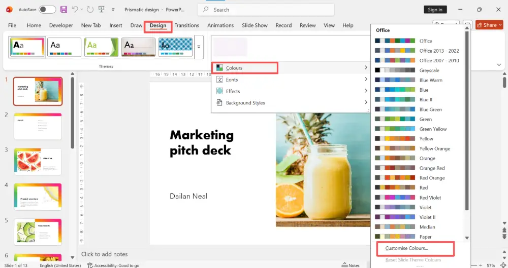
To change the color theme to blue warm specifically: in Step 5, look for the "Blue Warm" preset, or create a custom palette using the hex codes from the table above.
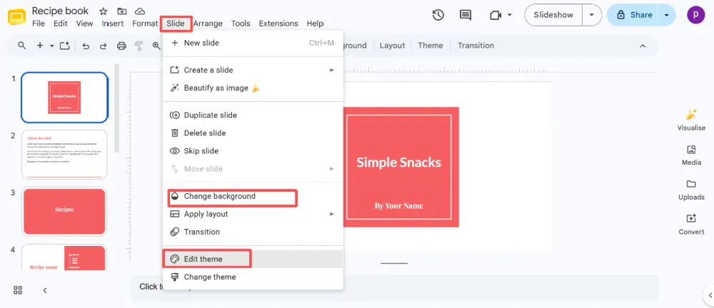
How to Change the Color Theme in Google Slides
- Open your presentation in Google Slides.
- Click Slide → Edit theme.
- In the theme editor, click on individual elements (background, text, accents) and change their colors.
- Alternatively, click Slide → Change background to set a slide or all-slide background color.
- For a consistent palette, update the master slides: change the titles, body text, and shape fills on the master, and every slide will inherit the changes.
💡 Pro tip: Skip the manual color work entirely — AI presentation tools like Gamma.com.ai apply a professional color palette automatically when you create a presentation. You can switch themes with one click and every slide updates instantly, so you never have to touch hex codes.
5 Rules for Using Color in Presentations
- Limit to 3–5 colors: more than that looks chaotic.
- Ensure contrast: text must be easy to read against the background. Dark text on light, or white text on dark — never gray on gray.
- Use accent color sparingly: the highlight color should appear on the one thing you want people to notice, not everywhere.
- Be consistent: same color for the same type of element across all slides (all titles one color, all icons another).
- Test on a projector: colors look different on a screen vs. projected. Check readability in the actual presentation setting.
Conclusion
The right color palette for a presentation sets the tone, guides the eye, and makes your deck look cohesive. Start by matching your colors to your message (blue for trust, green for growth, red for action), build a palette with 3–5 clear roles (background, accents, text, highlight), and apply it consistently across all slides. Use the ready-to-use palettes above or generate your own — and if you want professional colors without the manual work, AI slide tools automatically apply polished themes.
FAQs
What are the best colors for presentations?
Blue is the most popular — it signals trust and professionalism. Green works for sustainability and health, red for urgency and action, and neutrals (gray, charcoal) for clean, data-heavy slides. Match the color to the message: what do you want the audience to feel?
How do I change the color theme in PowerPoint to blue warm?
Go to Design → Variants → Colors dropdown. Look for the "Blue Warm" preset and click it. The theme applies to all slides instantly. You can also click Customize Colors to enter specific hex codes and save your own version.
How many colors should a presentation have?
Stick to 3–5 colors: a background, a primary accent, a secondary accent, a text color, and optionally a highlight. More than that looks cluttered. Use each color consistently for the same type of element across all slides.
How do I make sure my colors are readable?
Ensure strong contrast between text and background — dark text on light backgrounds, or white text on dark. Avoid gray-on-gray or low-contrast combinations. Test your slides on a projector or screen-share before presenting, since colors look different projected vs. on a laptop.
Where can I find ready-to-use presentation palettes?
Palette generators like Coolors, Adobe Color, and Canva's color wheel create harmonious palettes in seconds. The table above also includes six ready-to-use palettes with hex codes. Or use an AI presentation tool that applies professional themes automatically.